
Learn the Proper Human Diet
Eleven core principles. A food list that actually makes sense. The framework that has helped thousands reclaim their health.

The Proper Human Diet
Real food, real results, and a real community. Built by a family physician who actually uses it.
Welcome
I am a board-certified family physician practicing in rural Tennessee. For more than twenty years I have helped patients reverse obesity, insulin resistance, type 2 diabetes, and the long list of conditions modern eating is making worse.
My job is to give you the tools to do the same. Real food. Plain answers. No fad, no fluff, no diet drama.

Where to start
Eleven core principles. A food list that actually makes sense. The framework that has helped thousands reclaim their health.
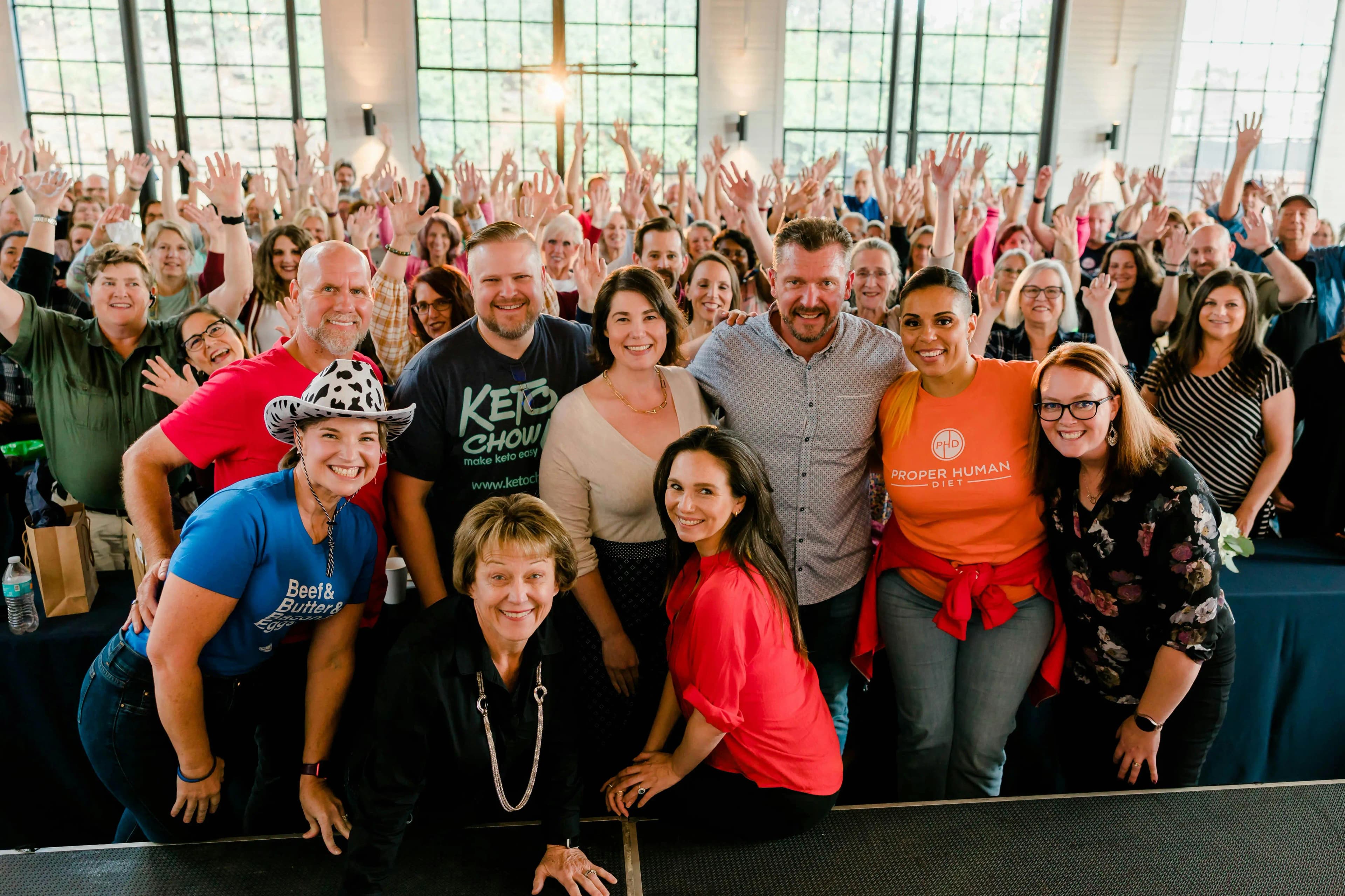
Live Q&A with Dr. Berry three times a week. PHD coaches in your corner. People doing the work alongside you.
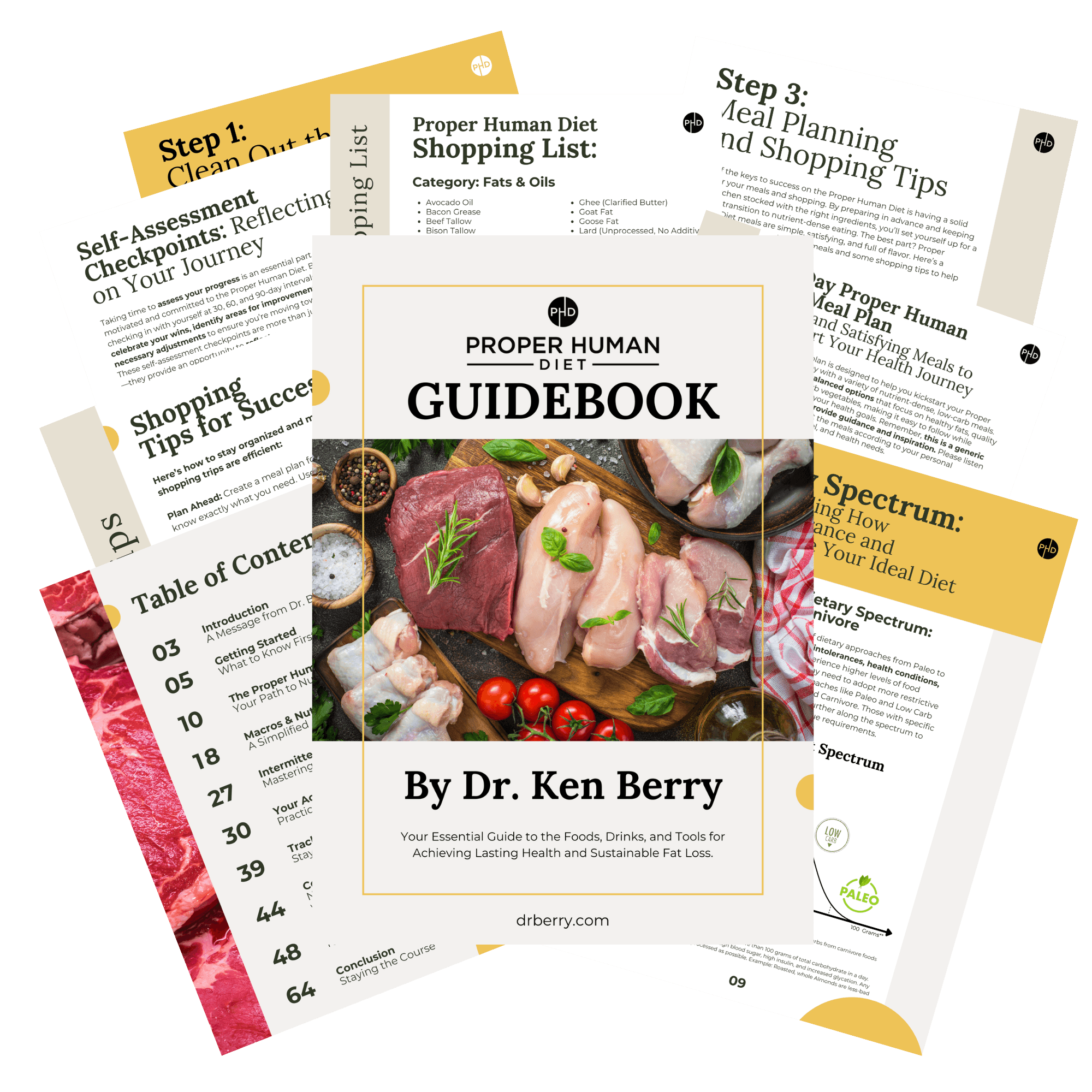
Free download
Sixty pages. The eleven core principles. The full food list. Meal ideas, shopping list, and a simple starting plan. It has helped over fifteen thousand people get their health back. Yours for the cost of an email address.
Featured & trusted



Real stories
“17 lbs in just 7 days on strict carnivore. I've never felt better!”
“So many family members commented on my weight loss and asked tons of questions. It was such a pleasure to show them my results.”
“Last Monday I went full carnivore and today I report 5 more lbs lost. I love how I feel. Long road ahead but worth it!”
“I've lost over 20 inches and the inflammation was unreal. No other way of eating has been this easy to stick with. Happily carnivore for life.”
“First 30 days toward carnivore: lost 18 lbs and 2 inches, and the energy is kicking in. Excited and still going strong!”
“Today I celebrate my one year anniversary as a carnivore. My friends still cannot believe how much better I feel.”
Stories shared by PHD Community members. Individual results vary and are not typical. Nothing here is medical advice or a promise of results — always work with your own physician.
Now streaming
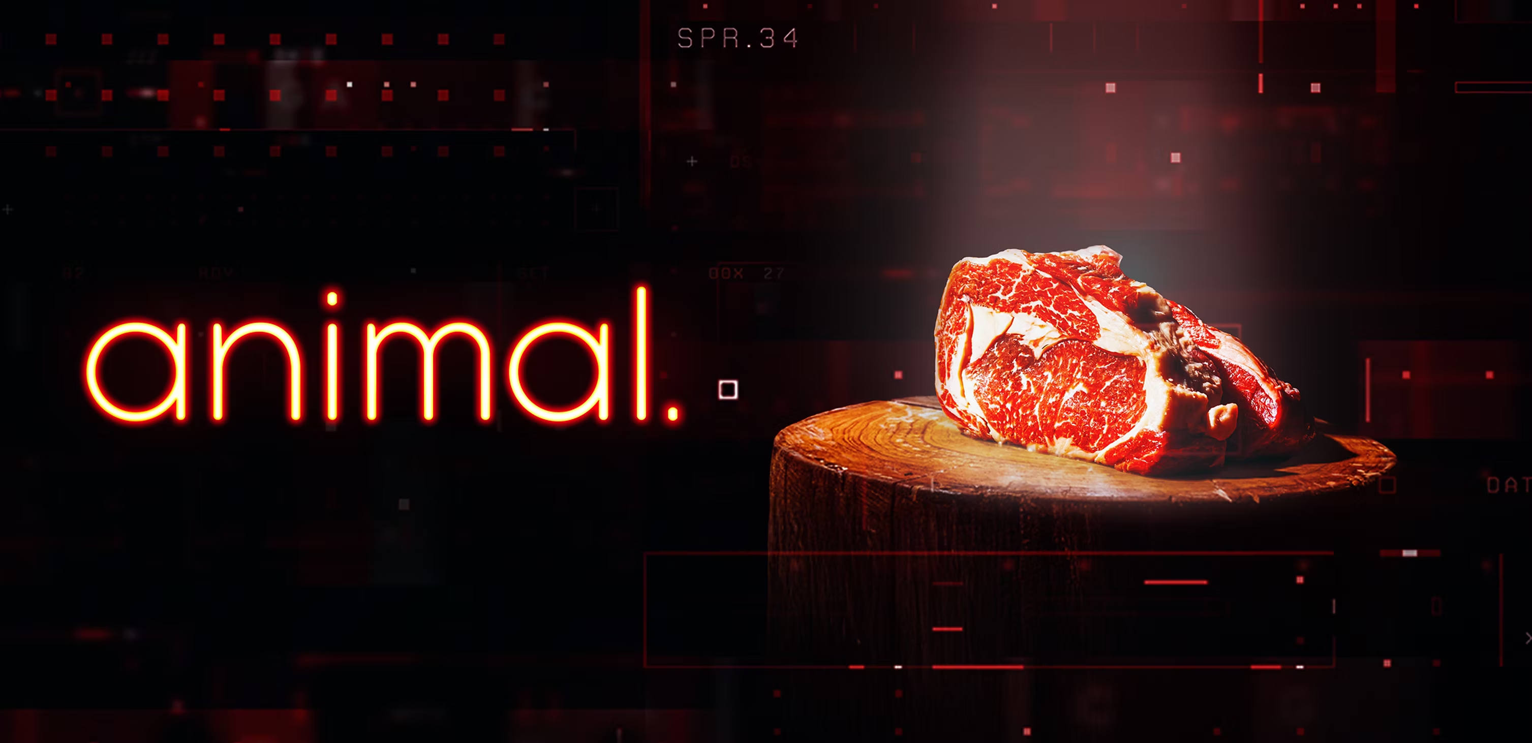
Dr. Berry joins the documentary exploring why real, animal-based food is the foundation of human health.
See Dr. Berry live
Dr. Berry speaks at conferences, festivals, and homestead events around the country. See the full schedule and grab tickets.
Books by Dr. Berry
.webp&w=3840&q=75)
.webp&w=3840&q=75)
.webp&w=3840&q=75)